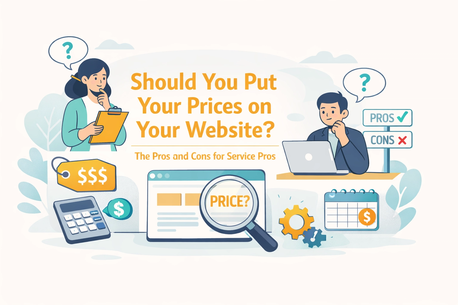
Tabs Booking Explained: Why Service Websites Need Simple Navigation (Or Lose 40% of Bookings)
Poor website navigation is costing service businesses real money. Here's why tab-based booking systems convert better, and how to get one without the headache.
You've got a website. Your services are listed. Your phone number is plastered on every page. But potential clients keep bouncing before they book.
The culprit? Your navigation is probably a maze.
Research shows that websites with confusing navigation lose up to 40% of potential bookings before visitors even reach the scheduling page. For service businesses operating on slim margins, cleaning companies, HVAC techs, landscapers, pet groomers, that's not just inconvenient. That's a revenue bleed you can't afford.
Let's talk about tabs booking and why the simplest navigation wins every single time. 🎯
What Is Tabs Booking? (And Why It Matters More Than You Think)
A tabs booking system isn't just a calendar widget slapped onto your website. It's a centralized digital platform that manages your entire booking operation, from appointment scheduling and client communication to payment processing and follow-ups.
Think of it as your operational hub. One place where clients can:
- Browse your services
- Check real-time availability
- Book an appointment
- Pay upfront
- Receive automated confirmations
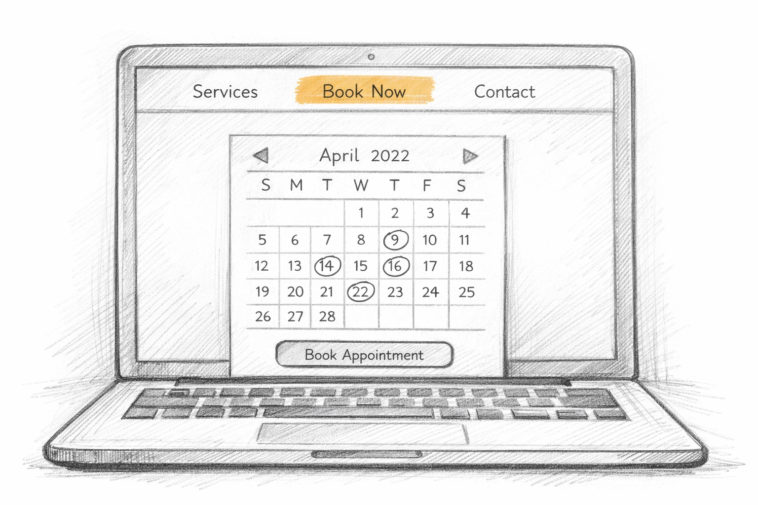
But here's where the "tabs" part comes in: the interface should be so intuitive that clients can move through these steps without thinking. Tab-based navigation, where services, booking options, and account management are organized into clean, clickable sections, makes that possible.
The key word? Intuitive. Your grandmother should be able to book your HVAC tune-up without calling for tech support.
Why Service Businesses Lose Bookings to Bad Navigation
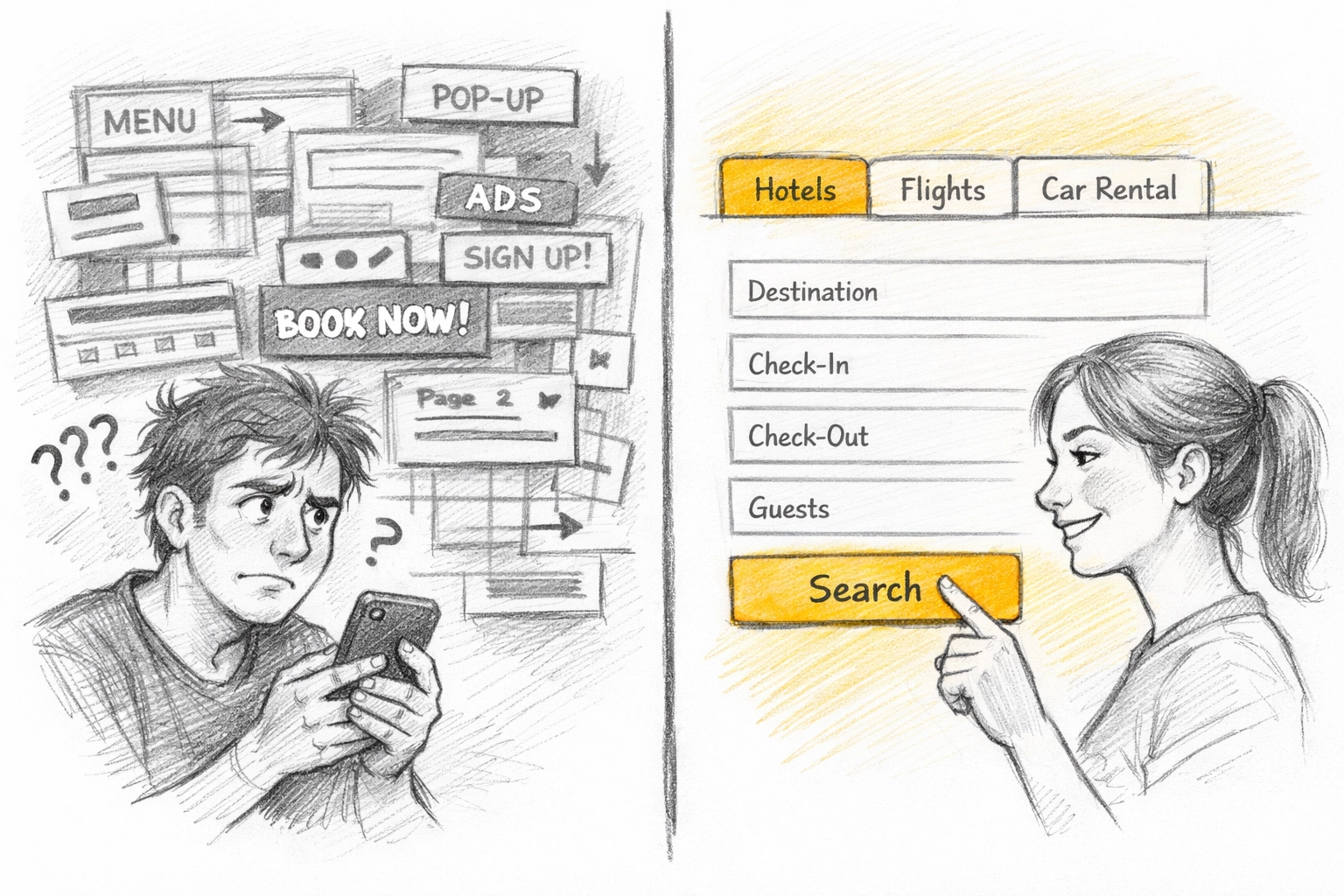
Let's be honest: most small business websites are Frankenstein creations. You started with a $200 WordPress template, added a booking plugin, integrated a payment processor, and duct-taped it all together with hope.
The result? A user experience that feels like navigating a haunted house blindfolded.
Here's what happens when navigation isn't simple:
1. Decision Fatigue Kills Conversions
When a potential client lands on your site and sees eight menu items, three sidebars, and five calls-to-action screaming for attention, their brain checks out. Studies show that every additional click reduces conversion by an average of 7%.
For service businesses, that means:
- Click to "Services" page → 7% drop
- Click to specific service → another 7% drop
- Click to booking form → another 7% drop
- Realize they need to create an account first → 50% abandon
You've lost nearly a third of your visitors before they even saw your calendar.
2. Mobile Users Bounce Faster
Over 60% of service bookings now start on mobile devices. If your navigation requires pinching, zooming, or hunting for a hidden menu, you're done. Mobile users have zero patience for complexity.
Tab-based navigation translates beautifully to mobile, swipe between "Services," "Book Now," and "My Appointments" without ever feeling lost.
3. Hidden Booking Buttons = Lost Revenue
I've seen service websites where the booking button is buried at the bottom of a 2,000-word "About Us" page. That's not strategy. That's self-sabotage.
A proper tabs booking system puts scheduling front and center. The moment someone lands on your site, they should see:
- What you offer (Services tab)
- When you're available (Calendar/Booking tab)
- How to get started (Book Now button)
Three clicks maximum. Anything more and you're competing with companies that respect their clients' time.
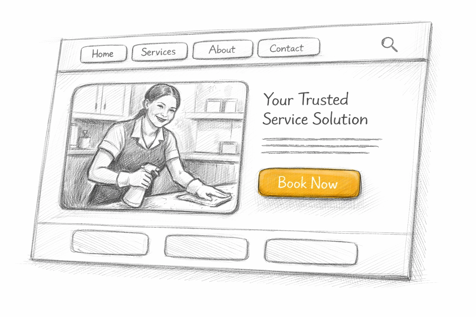
What Good Tabs Booking Navigation Actually Looks Like
Here's the anatomy of a service website that converts:
Core Tabs Structure
Your navigation should have 3-5 tabs maximum:
- Home/Services – What you do, clearly explained
- Book Now – Direct link to real-time availability
- Pricing – Transparent costs (no one likes surprises)
- About/Contact – Social proof and how to reach you
- Client Portal (optional) – For returning customers to manage appointments
That's it. No "Blog," no "Team Bios," no "Our Philosophy." Those can live as dropdown items if you need them, but they shouldn't clutter your main navigation.
Visual Clarity
Good tabs booking systems use:
- High-contrast buttons – Your "Book Now" button should be impossible to miss
- Consistent placement – Navigation stays in the same spot on every page
- Clear labels – "Book Appointment" beats "Schedule a Consultation" every time
- Visual cues – Active tabs are highlighted so users always know where they are
Booking Flow Integration
The magic happens when your tabs aren't just navigation, they're a guided journey. A client should be able to:
→ Land on your homepage
→ Click "Services" to browse options
→ Click "Book Now" to see availability
→ Select a time slot
→ Enter their details
→ Pay (if required)
→ Get instant confirmation
All without leaving your website. No phone calls. No email back-and-forth. No wondering if their appointment is confirmed.
The Hidden Cost of "Feature-Rich" Booking Systems
Here's where a lot of service businesses go wrong: they pick booking software based on feature lists instead of user experience.
You don't need:
- AI-powered predictive scheduling
- 47 calendar view options
- Integration with every CRM known to humanity
You need a system that makes it dead simple for clients to book, and for you to manage those bookings without a second thought.
Modern platforms like Kejoola are built specifically for this. Instead of overwhelming you with enterprise features designed for Fortune 500 companies, they focus on what service businesses actually need:
✅ Real-time availability that syncs with your actual schedule
✅ Automated confirmations and reminders so clients show up
✅ Integrated payments so you get paid before you roll the truck
✅ Mobile-friendly interface that works on any device
✅ Client portal where repeat customers can self-manage appointments
And critically: setup takes hours, not weeks. Most modern booking platforms are designed so you can outline your services, set your hours, add a booking widget to your site, and start taking appointments the same day.
Real-World Impact: What Simple Navigation Changes
Let me give you a concrete example.
A local cleaning service switched from a DIY WordPress booking form (buried three clicks deep) to a proper tabs booking system. Their changes:
- Added "Book Now" as the first tab in their navigation
- Simplified their service selection to five core options
- Enabled real-time availability so clients could self-schedule
- Added SMS confirmations to reduce no-shows
The result? Bookings increased by 34% in the first month. Not because they changed their services or pricing, simply because they made it easier to say "yes."
That's the power of tabs booking with intentional navigation.
Common Navigation Mistakes to Avoid
Even with the best booking software, these mistakes will tank your conversion:
❌ Too many menu items – More than six options creates decision paralysis
❌ Generic labels – "Solutions" and "Offerings" mean nothing; use "Services" and "Book Now"
❌ Hidden pricing – Make clients email for a quote and watch your bookings crater
❌ Multi-step forms on separate pages – Every page transition loses 10-15% of users
❌ No mobile optimization – If your tabs don't work on a phone, you're invisible to most clients
Your navigation should answer three questions instantly:
- What do you do?
- What does it cost?
- How do I book right now?
If a visitor has to hunt for any of those answers, they're already looking at your competitor's site.
How Kejoola Makes Tabs Booking Effortless
Look, you didn't start a cleaning business or HVAC company because you love web design. You've got actual work to do.
That's why Kejoola strips out the complexity. You get:
- Pre-built service templates for common business types (so you're not starting from scratch)
- Drag-and-drop page editor to customize without touching code
- Built-in tabs navigation that's already optimized for conversion
- Booking widget that lives on every page: no hunting required
- Automated scheduling that syncs with your calendar and sends reminders automatically
The entire platform is designed around one principle: getting clients from "interested" to "booked" in under 60 seconds.
And because it's built specifically for service businesses, you're not paying for enterprise features you'll never use. You're paying for a system that just works.
Want to see how much simpler your booking process could be? Try Kejoola's booking software designed specifically for small service businesses.
Your Action Plan: Fix Your Navigation This Week
You don't need a complete website rebuild. Start here:
Step 1: Audit your current navigation. Count how many clicks it takes to book an appointment from your homepage. If it's more than three, you have work to do.
Step 2: Simplify your menu. Cut it down to 3-5 core tabs. Everything else can be secondary.
Step 3: Make "Book Now" unmissable. It should be in your navigation bar AND featured prominently on your homepage.
Step 4: Test on mobile. Pull out your phone and try to book your own service. If you struggle, so will your clients.
Step 5: Switch to a proper booking platform. If your current setup requires manual calendar management or clients calling to confirm, you're leaving money on the table. Modern systems like Kejoola automate all of that.
Pro Tip: The best navigation is invisible. Clients shouldn't notice your tabs: they should just find what they need and book without thinking about it.
The Bottom Line
Tabs booking isn't some fancy tech buzzword. It's just smart business.
When your website navigation is clean, intuitive, and focused on getting clients to "Book Now" as quickly as possible, you stop losing bookings to friction. You stop fielding phone calls at 9 PM from people who couldn't figure out your website. You stop watching competitors steal clients simply because their booking process is easier.
Your website should work for you, not against you. And in 2026, that means tabs booking with navigation so simple that booking an appointment feels effortless.
If you're ready to stop losing 40% of potential bookings to a confusing website, check out how Kejoola makes service booking dead simple. Because your clients shouldn't need a map to hire you. 🚀