7 Standout Service Page Examples to Inspire You in 2026
Discover the best service page examples to inspire your own website. We break down what makes each design effective, from SEO and CTAs to pricing and mobile optimization.

A great service page does more than just list what you do; it convinces potential customers that you are the right choice and makes it easy for them to book an appointment. For local service providers like plumbers, stylists, or tutors, this page is often the most critical point of conversion. It’s where a curious visitor decides to become a paying client. But building one that effectively balances information, persuasion, and functionality can be a challenge.
This guide simplifies the process by showing you exactly how it’s done. We have gathered the best service page examples from across the web to give you clear, actionable inspiration. Instead of just showing you pretty designs, we break down precisely what makes each page work. You'll see annotated screenshots highlighting key elements like local SEO integration, compelling headlines, clear calls-to-action (CTAs), and smart pricing displays.
Each example includes a strategic analysis, replicable tips, and short templates you can adapt for your own site. Our goal is to provide a practical playbook for creating a service page that not only looks professional but also drives bookings and grows your local business. Let's explore the designs that are setting the standard.
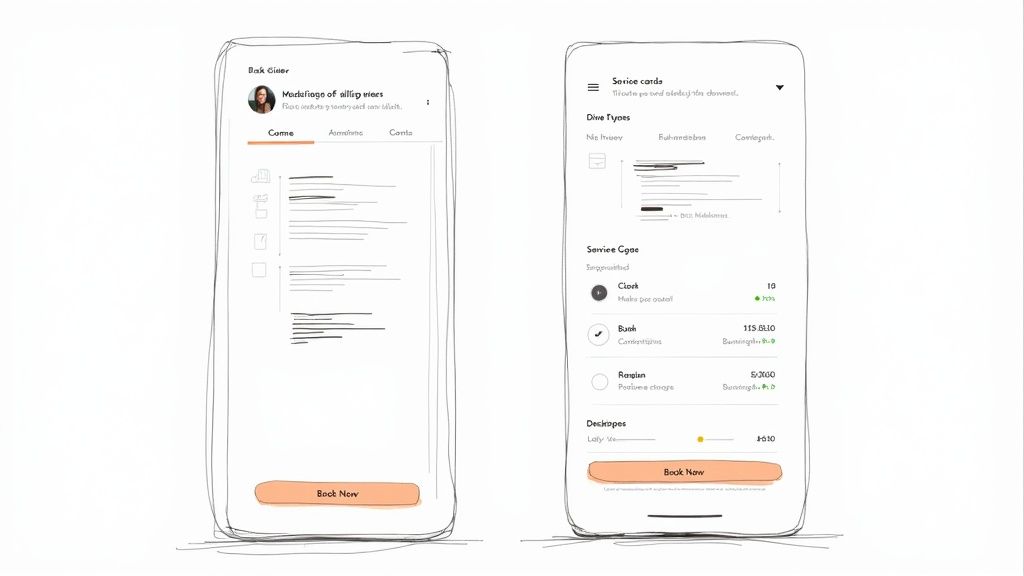
1. Kejoola Homepage
Kejoola takes a different approach by not just showing you an example, but giving you the tools to create your own high-converting service presence instantly. It’s an all-in-one platform built for appointment-based businesses like salons, tutors, and cleaners who need a professional website with integrated booking, minus the technical headaches. Instead of cobbling together plugins or hiring a developer, Kejoola generates a complete, booking-ready site in minutes.

This makes it a standout choice because it directly solves the core problem for service providers: getting online and taking appointments efficiently. The platform automatically creates essential pages, including a homepage and a dedicated services list, that are designed from the ground up to be clear and effective.
Strategic Analysis: Why It Works
Kejoola’s strength is its purpose-built design. Unlike general website builders where booking is an afterthought, here it's the central function. This focus provides a superior user experience for both the business owner and the customer.
Key Insight: By integrating service listings, real-time availability, and payment processing into a single, native system, Kejoola removes the friction that causes potential customers to drop off. The path from viewing a service to completing a booking is direct and simple.
The platform includes several key features that contribute to its effectiveness as a source for excellent service page examples:
- Native Booking System: Availability updates in real-time, preventing double bookings and eliminating the need for manual confirmation.
- All-in-One Solution: It bundles hosting, SEO-friendly page structures, a booking dashboard, and automated client reminders. This consolidation saves time and reduces overhead.
- Rapid Deployment: A business can go from sign-up to a fully functional, professional-looking website in minutes, not weeks.
Actionable Takeaways & Replicable Strategies
- Prioritize an Integrated Booking Flow: Your service page should guide users directly to booking. Kejoola does this by placing service details (price, duration) next to a clear booking button, a model any business can adopt.
- Automate Client Communication: Use a system that sends automatic booking confirmations and reminders. This reduces no-shows and administrative work, a key feature built into Kejoola.
- Simplify Your Tech Stack: For most small service businesses, a single, dedicated platform is more effective than managing multiple tools (website, booking plugin, email reminders). This approach ensures everything works together smoothly.
Platform Breakdown
| Feature | Details |
|---|---|
| Ideal For | Appointment-based businesses (salons, tutors, coaches, cleaners). |
| Key Advantage | Generates a booking-ready website in minutes with zero technical skill. |
| Pricing | Subscription-based model, offering an all-in-one package. |
| Pros | Rapid setup, native booking, designed for service businesses. |
| Cons | Less suitable for complex e-commerce or non-appointment sites. |
Booking-ready websites for service pros
2. Squarespace Blog — Service Page Design: Complete Guide and Examples
Instead of just showing finished products, the Squarespace Blog offers a detailed blueprint for building a high-performing services page from the ground up. This guide is less of a gallery and more of a strategic manual, making it an excellent starting point for business owners who feel overwhelmed by the design process. It breaks down the anatomy of an effective page, providing a clear, section-by-section framework that translates to any website builder, not just Squarespace.

The guide's main strength is its focus on structure. It advocates for a two-tiered approach: a primary "Services" overview page that directs visitors, and dedicated subpages for each specific service you offer. This setup is perfect for local SEO, as it allows you to create targeted content for keywords like "residential window cleaning in [City]" on one page and "commercial pressure washing in [City]" on another. The advice is practical and geared toward conversion, covering essentials like presenting pricing packages, integrating booking calendars, and writing compelling calls to action.
Strategic Analysis & Takeaways
What makes this resource a top-tier pick among service page examples is its educational approach. It doesn't just show you what works; it explains why it works and gives you the components to do it yourself.
- Key Insight: The guide champions a modular design. Think of your service page as a set of building blocks: an introduction, a service menu, a pricing table, a booking CTA, and a FAQ section. This modularity simplifies the design process for beginners.
- Actionable Takeaway: Start by outlining these blocks for your own business before you even open a website editor. For each service, define the problem you solve, the process, and the price.
- Pro Tip: Use the article's advice to build out dedicated pages for each of your main services. A "Lawn Mowing" page and a separate "Garden Weeding" page will rank better for specific local searches than a single, generic "Gardening Services" page.
You can access the full guide for free on the Squarespace Blog. While it includes some platform-specific tips, the core principles on content, layout, and customer journey are universal.
3. Webflow Blog — How to build a services website: Best practices and 5 examples
The Webflow Blog provides a compact, visually-driven guide that pairs five modern website examples with tactical advice. This resource is perfect for service providers who learn best by seeing patterns in action. It focuses on the critical balance between a scannable main "Services" page and in-depth individual service pages, offering a masterclass in information architecture. The post emphasizes clarity and conversion through strong design and copy.

Unlike sprawling galleries, this guide is quick to digest but packed with valuable insights. It uses its curated examples to illustrate core principles like establishing credibility, clarifying your message, and placing calls-to-action effectively. For those specifically looking into best practices for building service websites, an in-depth Industrial Website Design playbook can offer valuable strategies for lead generation. The Webflow article excels at showing how to structure content so visitors can quickly understand what you do and how to hire you.
Strategic Analysis & Takeaways
What sets this guide apart is its focus on scannability and visual hierarchy, which are crucial for retaining visitor attention. It champions a clean, organized layout that guides the user’s eye directly toward conversion points.
- Key Insight: A successful services overview page doesn't need to detail every single offering. Its job is to provide a clear, concise menu that directs users to the specific solution they need, much like a restaurant menu guides diners to their desired dish.
- Actionable Takeaway: Review your main services page. Is it a wall of text? Try converting your service descriptions into a grid or card-based layout, with each card featuring a clear heading, a one-sentence summary, and a "Learn More" button that links to a dedicated page.
- Pro Tip: Use the checklist-style advice in the article to audit your own page. Ask yourself: Is my primary call-to-action immediately visible? Is my value proposition stated within the first five seconds of a visitor landing on the page?
You can access the guide on the Webflow Blog for free. While it subtly promotes its own platform, the advice on layout, copy, and architecture is universally applicable to any service page examples project.
4. SiteBuilderReport — 30+ Inspiring Service Page Design Examples (2026)
SiteBuilderReport offers a pure, high-volume gallery of inspiration. This collection of over 30 real-world service pages is designed for quick scanning and pattern recognition. It's the perfect resource for a local business owner who isn't sure how to structure their page, present pricing, or write a compelling headline. The sheer variety, covering everything from creative agencies to local trades, allows you to find examples directly relevant to your industry.

Unlike guides that explain theory, this page shows theory in practice. By scrolling through the examples, you can immediately compare different approaches to visual hierarchy, call-to-action placement, and building trust. Because the list is updated for modern design trends, you get a current snapshot of what works today. The main drawback is the minimal commentary; you are left to interpret why each design is effective on your own.
Strategic Analysis & Takeaways
The real value of this collection lies in its breadth, making it a fantastic brainstorming tool. It's one of the best places to find service page examples that spark ideas for your own layout and copy.
- Key Insight: Comparing multiple pages at once reveals common patterns. You’ll notice that most effective pages place a clear value proposition and a primary CTA "above the fold," use high-quality images of their work, and include social proof like testimonials or client logos.
- Actionable Takeaway: Open the gallery and find 3-5 examples from businesses similar to yours. Screenshot their hero section, their service breakdown, and their pricing table. Use these as a visual reference to sketch out your own page structure.
- Pro Tip: Pay attention to the language used. How do other businesses in your field describe their services? Note the action verbs they use in headlines and the way they address customer pain points. This is a great way to overcome writer's block.
The full gallery is available for free on SiteBuilderReport's website. While some of the featured sites may change their designs over time, the collection serves as an excellent, up-to-date starting point for any service provider.
5. DesignRush — Best Services Page Website Designs of 2026
DesignRush provides an “awards-style” gallery of top-performing service pages, updated annually to reflect current design trends. Instead of deep-diving into a single example, it offers a quick, high-level overview of many, making it a powerful tool for visual inspiration and identifying modern user experience (UX) patterns. This is the perfect resource for getting a fast-track understanding of what makes a service page feel professional and trustworthy.

The collection stands out by focusing on the "why" behind each design choice, albeit briefly. Each featured site comes with a short rationale explaining what it does well, such as using benefits-focused headlines, creating scannable service packages, or integrating high-quality visuals. While the curation often leans toward digital agencies and tech companies, the core principles of clarity, conversion-focused design, and strong visual hierarchy are directly applicable to any local service business, from a plumber to a dog groomer.
Strategic Analysis & Takeaways
The value of DesignRush is its role as a visual benchmark. It quickly shows you what "great" looks like, which is useful for setting design goals or getting stakeholder buy-in on a specific creative direction. It’s an ideal starting point for brainstorming.
- Key Insight: The roundup emphasizes the importance of first impressions and clarity. The best pages immediately answer what the service is, who it's for, and why the visitor should care, all within the first scroll.
- Actionable Takeaway: Browse the list and find 2-3 examples that resonate with your brand. For each one, write down the specific elements you like: Is it the color scheme? The clear pricing table? The way they present testimonials? Use this as a tangible mood board for your own design.
- Pro Tip: Pay attention to the copywriting. Many of the highlighted service page examples use action-oriented, benefit-led language. Instead of "We Offer Lawn Mowing," they say "Get a Perfect Lawn Without the Work." This simple shift can dramatically improve your conversion rate.
You can browse the full collection for free on the DesignRush website. Use it to gather ideas before you commit to a specific layout or design direction.
6. WebFX — 6 Service Page Web Design Examples to Inspire You
Digital marketing agency WebFX offers a blog post that functions as a masterclass in simplicity. This resource curates six service page designs and breaks down exactly why each one is effective from a conversion-first perspective. It’s an ideal read for local business owners who want clear, direct advice on what elements to include for maximum impact, without getting lost in complex design theory. The analysis focuses on practical wins, like clear visual hierarchy, scannable copy, and well-placed calls to action.
The strength of this WebFX post is its focus on quick, actionable improvements. It explains concepts like using trust badges (e.g., certifications, awards) to build credibility and writing headlines that speak directly to a customer's problem. By dissecting both B2B and B2C examples, it provides a broader perspective, but its core lessons are perfectly suited for local service providers. The emphasis on mobile-friendly, simple layouts makes its advice particularly relevant for businesses whose customers are often searching for services on their phones.
Strategic Analysis & Takeaways
What makes this a valuable collection of service page examples is its pragmatic, beginner-friendly approach. The explanations are easy to digest and translate directly into a checklist for your own website redesign.
- Key Insight: A successful service page is not about flashy design; it's about clarity and trust. The post shows how simple layouts with strong headlines, concise service descriptions, and visible customer proof (like testimonials or partner logos) outperform cluttered, confusing pages every time.
- Actionable Takeaway: Audit your current service page against the examples. Do you have a single, clear CTA repeated throughout the page? Are your trust signals visible above the fold? Use the post as a punch list to identify immediate improvement areas.
- Pro Tip: Pay close attention to their advice on scannability. Use short paragraphs, bullet points, and bolded text to highlight the core benefits of your service. A visitor should be able to understand what you do and why they should hire you in less than 15 seconds.
You can read the full article for free on the WebFX blog. It provides a solid foundation for building a service page that works.
7. Hurrdat Marketing — 9 Service Page Examples & Why They Work
Hurrdat Marketing’s article offers a tightly curated list focused on the "why" behind effective service pages. Instead of a sprawling gallery, it provides nine specific examples and dissects them through the lens of conversion psychology. This resource is perfect for local business owners who need to understand the strategic elements that build trust and persuade visitors to book a service, moving beyond just visual appeal.

The guide excels at connecting specific design choices to business goals. For each example, it explains how elements like brand voice, benefit-driven content blocks, and clear calls-to-action work together to guide a user's journey. It highlights the importance of social proof by showing how testimonials and visuals are integrated, and it touches on pricing transparency. The mix of industries, including local services and fitness, makes the advice adaptable for many types of small businesses.
Strategic Analysis & Takeaways
This collection stands out among service page examples because its commentary is directly tied to actionable conversion tactics. It gives you a framework for evaluating your own page and identifying weak spots.
- Key Insight: An effective service page is a conversation. Hurrdat’s analysis shows how to align your brand voice with your content to answer a potential customer’s questions proactively- from what the service does to why they should trust you.
- Actionable Takeaway: Review your current service page. Does it clearly state the benefits (the "what's in it for me") before detailing the features? Use the article's examples to find opportunities to add benefit-focused headlines and bullet points.
- Pro Tip: Pay close attention to how the examples use different types of calls-to-action (CTAs). Instead of a generic "Contact Us," try a more specific and lower-commitment CTA like "Get a Free Quote" or "Check Availability" to reduce friction and increase clicks.
You can read the full article for free on the Hurrdat Marketing website. Its practical focus makes it a valuable tool for turning your service page into a more effective sales asset.
7 Service Page Examples Comparison
| Item | Implementation Complexity 🔄 | Resource Requirements ⚡ | Expected Outcomes 📊 | Ideal Use Cases 💡 | Key Advantages ⭐ |
|---|---|---|---|---|---|
| Kejoola Homepage | Very low — turnkey setup, no dev required | Minimal — content, branding; hosting included | Fast launch of booking-enabled site; fewer no-shows | Small appointment-based businesses (salons, tutors, cleaners) | Native booking, all-in-one stack, rapid professional presence |
| Squarespace Blog — Service Page Design | Low–Medium — content structure guidance; platform-dependent | Low — copy, imagery, basic page building | Clear, conversion-friendly service pages when applied | Solo providers and beginners planning service pages | Actionable, platform-agnostic framework and section guidance |
| Webflow Blog — How to build a services website | Low–Medium — design-focused; needs builder familiarity | Low–Medium — design time, examples to adapt | Scannable, conversion-focused layouts and IA improvements | Designers or visual thinkers balancing overview vs detail | Modern examples, IA and checklist-driven guidance |
| SiteBuilderReport — 30+ Examples | Very low — browsing inspiration only | Time investment to review and interpret examples | Broad idea pool for layouts, messaging, pricing blocks | Teams seeking variety and niche-relevant patterns | Large, up-to-date gallery across many industries |
| DesignRush — Best Services Page Designs | Low — curated editorial summaries | Minimal — quick benchmarking resources | Fast identification of standout UX and content elements | Stakeholder alignment and benchmarking projects | Concise “best of” examples with quick rationales |
| WebFX — 6 Examples to Inspire | Low — straightforward examples with clear reasons | Low — implementable takeaways for small sites | Practical improvements in clarity, CTAs, and hierarchy | Small U.S. businesses seeking quick wins | Pragmatic, conversion-first recommendations |
| Hurrdat Marketing — 9 Examples | Low — concise case explanations | Low — focus on copy, proof elements, CTAs | Better trust signals and guided booking flows | Local providers needing fast trust-building tactics | Conversion-focused "why it works" commentary |
Final Thoughts
We've explored a variety of powerful service page examples, from clean, conversion-focused layouts to content-rich guides. The common thread among them is a deep understanding of the customer's journey. An effective service page does more than just list what you do; it answers questions, builds trust, and makes it incredibly easy for a potential customer to take the next step.
Your key takeaway should be that a successful page is a blend of clear communication and strategic design. It's not just about aesthetics. It’s about creating a direct path from a visitor’s problem to your solution.
Key Principles for a High-Converting Service Page
As you begin designing or refining your own page, keep these core principles at the forefront:
- Clarity Above All: A confused visitor will not convert. Use simple language, obvious headlines, and a straightforward layout to explain your service, its benefits, and the process.
- Build Instant Trust: Incorporate social proof like testimonials, case studies, or certifications. High-quality images of your team or your work in action also go a long way in establishing credibility.
- Guide the User: Every element on the page should guide the visitor toward your primary call to action. Whether it's "Book Now," "Get a Quote," or "Schedule a Consultation," make that button prominent and accessible.
- Address the "What's In It for Me?": Focus on the benefits and outcomes for the customer, not just the features of your service. Translate what you do into how you solve their specific problem or improve their situation.
Your Actionable Next Steps
Armed with the insights from these service page examples, it's time to act. Start by auditing your current service page (or planning your first one) with a fresh perspective. Ask yourself:
- Is my headline specific and benefit-driven?
- Can a visitor understand my core service within five seconds?
- Is my contact information or booking button visible without scrolling?
- Do I have trust signals like reviews or photos of my work?
Even small adjustments, like rewriting a headline or adding a new customer testimonial, can make a significant impact on your conversion rates. The goal is continuous improvement, not immediate perfection. By applying the strategies we've discussed, you are well on your way to creating a service page that works as a 24/7 salesperson for your business, turning casual browsers into loyal customers.
Feeling inspired by these service page examples but overwhelmed by the technical details? Kejoola builds booking-ready websites for service pros, combining professional design with the powerful, built-in scheduling tools you need. Get a site that not only looks great but is optimized from day one to attract local clients and fill your calendar. Booking-ready websites for service pros